For this iteration of the browser project I made a start on forms and fields. Progress was also implementing more CSS properties - display, width, height.
Forms and Fields.
Forms and fields are an integral part of any website and/or application, they form the basis of accepting user inputs. I didn’t really find representing them too difficult using the Java Swing GUI classes, as most input types have a direct mapping to a Swing component. For example, and input with a type of “text” can be easily represented with a JTextField - and a select field (aka drop down) with a JComboBox.
While matching different input types up with a corresponding GUI component is quite simple, getting these components to behave in expected ways and layout correctly on the page is another issue entirely. Take a radio button for example, each input (button) needs to be contained within a group so that the state of which button is checked can be tracked. Chrome (and I imagine other browsers) maintain this state by each input sharing the same name. Swing on the other hand tracks this state by using a ButtonGroup.
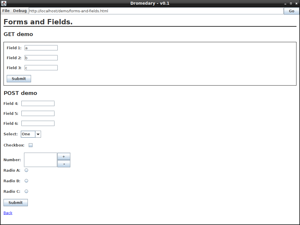
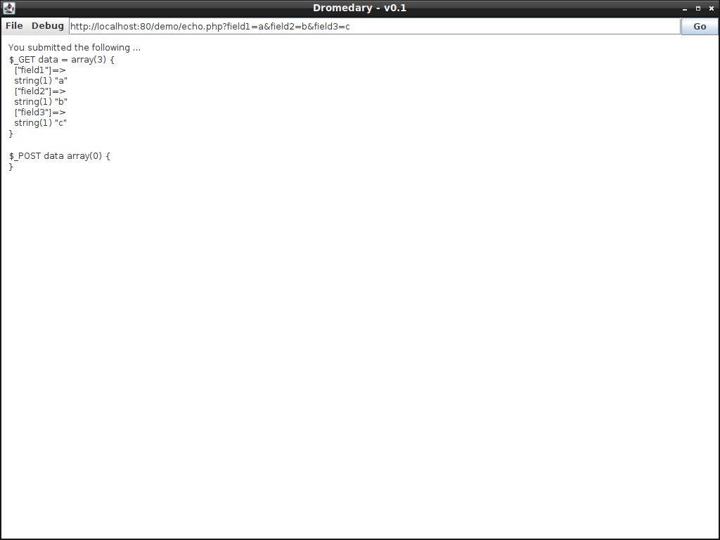
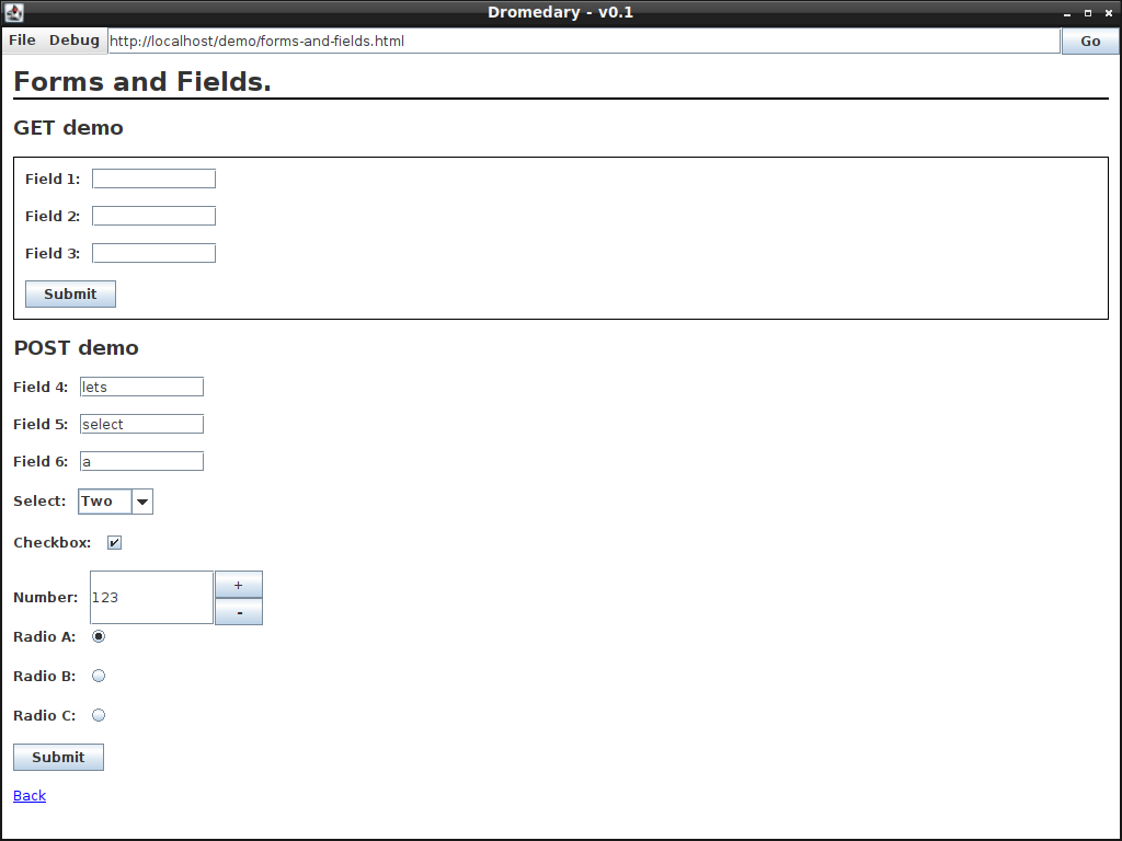
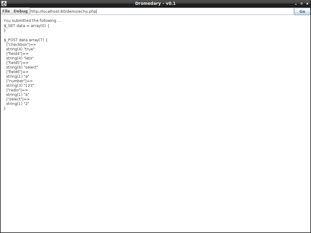
The following gallery contains some screenshots of the implemented input fields as well as a demo of GET and POST form submissions. A simple PHP script is being executed upon submission of the form which just echoes what data was submitted - it’s handy for testing.
CSS - Display, Width and Height
Time to implement some more CSS properties. For this iteration, display, width and height were implemented. The properties were tested via using the section view as a test candidate. The following screenshot shows several sections- coloured teal, yellow, red and green - displayed inline with various heights. The heights of each section are indicated via a paragraph element within each div, the width of each div remains fixed at 200 pixels. The last section - 10% height and green - overflows onto the next “line” of content, this is because the default dimensions of the frame are 1024 by 728 pixels - only having enough width to display 5 sections. Increasing the width of the frame will push the green section to be displayed in-line with the rest.
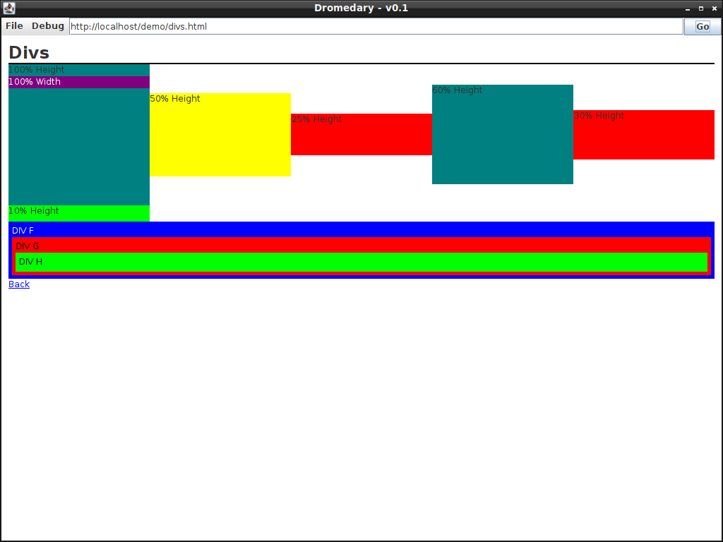

Lastly, sections F, G and H are displayed as blocks. They’re nested together with a padding of 10 pixels. The primary difference between a block and an inline element is that a block always occupies the entire width of its parent element, whereas an inline elements width depends on its contents, this is how I’ve chosen to implement inline and block elements at least. The purple section within the first teal section demonstrates nesting a block within an inline container.
Maybe I’ll implement images next.