Like any other browser, this browser supports images. Text and images provide the bulk of most websites, so it’s obviously very important they are supported. Can you imagine a shop without any images of products? disaster. I decided that now was then time to address resource loading and parallel processing, so quite a bit of effort was put into implementing the framework to make the browser embrace parallel processing - notably the creation of a task class, thread pool, repainting task and watchdog task to monitor threads for completion. Caching was also implemented this iteration, so images that are already loaded don’t need to be (down)loaded again.
Images
The ability to download and render an image is nothing new, this functionality has been implemented since the inception of this project and is relatively unchanged. Images are represented using the same view and component as they always have been - how they’re loaded has significantly changed though. For each image element that exists within the DOM an asynchronous image reading task is launched, so that the main thread of the application can load other resources at the same time as the current image. This means all images (and resources, stylesheets as well) can be loaded at the same time. Once loaded the image is cached and scaled appropriately depending on the width and height attributes of the image - or if neither attribute exists the image is left as is. Once the view has loaded, the image as required, determined by it’s associated CSS properties - more on this later - and you get something like the following screenshots.
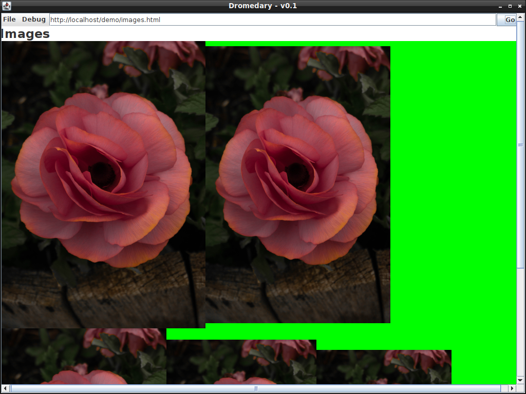
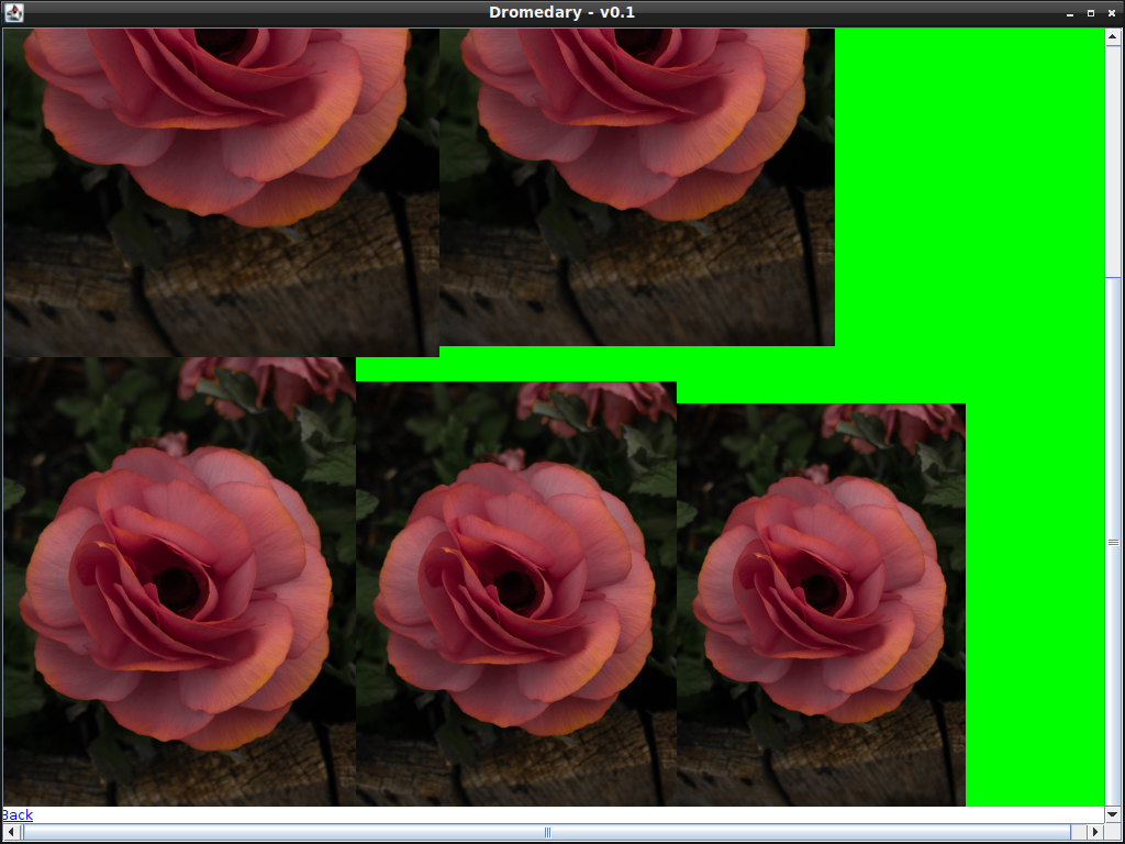
Images - unlike paragraphs - are displayed inline and not as a block. This means that if some image content were to overflow past the available screen space that content would flow to the next available line. Which is why images 3-5 appear beneath the first two images as per the above screenshots. The green background is the parent element that contains the images.
CSS - Transform
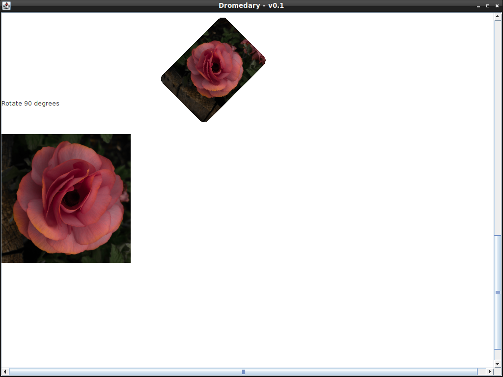
Part of the image implementation was to customise the painting process - i.e. overriding the paint method - of the swing component that was used for drawing images, I thought this was a good time to implement the CSS transform property. During painting certain transformations can be applied to the graphics context altering the appearance of the element. The element could be moved (translation), scaled or rotated. Element in this context doesn’t necessarily need to be an image it could be any DOM element - section, div, paragraph it doesn’t matter, all elements will eventually implement all transformations. It’s important to let the graphics object take care of the transformations in order to take advantage of any graphics acceleration that may be happening, I imagine manually manipulating the image data any other way would be horribly slow. As of now this rose image I’m using is ~14 mega pixels (3235 x 4477) and the entire page below was rendered in a second.
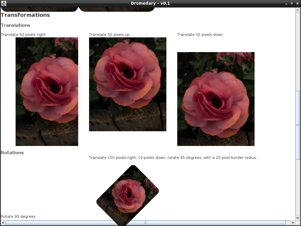
One gotcha with implementing the transformations is making sure that they’re applied in the correct order, this is mainly due to how the rotation transformation is applied. If left to its own devices the rotation uses the origin (0,0) - i.e. the top left corner according to the Java coordinate system - as its origin not the centre of whatever is being rotated. To deal with this I’ve had to (pre and post) concatenate the appropriate translation to move the rotations origin to the centre of the element that’s being rotated.
if(transform.getType() == rotation){
  double tx = size.width / 2;
  double ty = size.height / 2;
  transform.preConcatenate(AffineTransform.getTranslateInstance(tx, ty));
  transform.concatenate(AffineTransform.getTranslateInstance(tx*-1, ty*-1));
}
CSS - Border Radius
Sometimes square corners just don’t cut it, you’d like some rounded corners - that’s what the border radius property is for. Implementing this wasn’t too difficult it was as simple as clipping the component to a rounded rectangle - for images at least - for other components I’ll try to leverage the line border class. I’m not too sure if its possible to change how rounded the corners are though. If it doesn’t work I can always revert back to the clipping approach.

Images with the border radius property, the radius increases from left to right.
CSS - Clip Path
On the subject of clipping may as well implement the clip path property. The clip path property allows the user to selectively render part of an element - or a clip of an element. The shape and size of the clipped area depends on how the user defines the property. For example defining the clip path like “circle(50%)” will render half of the selected element with a circle. Something else like “polygon(50% 0%, 100% 100%, 0% 100%)” will render a triangle, where each vertex of the triangle is defined as a pair of coordinates. Currently the shapes supported are circle, polygon and inset - ellipse is still a work in progress.

DIvs showing the different varieties of clip path.
This has been quite a lot of work. Although I can see the project coming along, the CSS implementation is coming along quite nicely and so far there’s no major layout issues - there’s still some weird behaviour with the block flow layout (used by the HTML and div element) but I’m not too concerned about that … yet.
Here’s a list of the currently completed CSS properties:
background-color
margin (including the left, top, right, bottom properties)
padding (including the left, top, right, bottom properties)
border
border-*-style (including the left, top, right, bottom properties)
border-*-color (including the left, top, right, bottom properties)
border-*-width (including the left, top, right, bottom properties)
color
width
height
display (except inline, which might not be necessary)
border-radius
transform (except scale and skew)
clip-path (except ellipse)
Maybe its time to think about implementing tables.